This page is an offshoot from my personal website, paulromer.net. It has a bare minimum of CSS and HTML for reasons that are explained below. As a result, there is no navigation to take you back to paulromer.net other than this link:
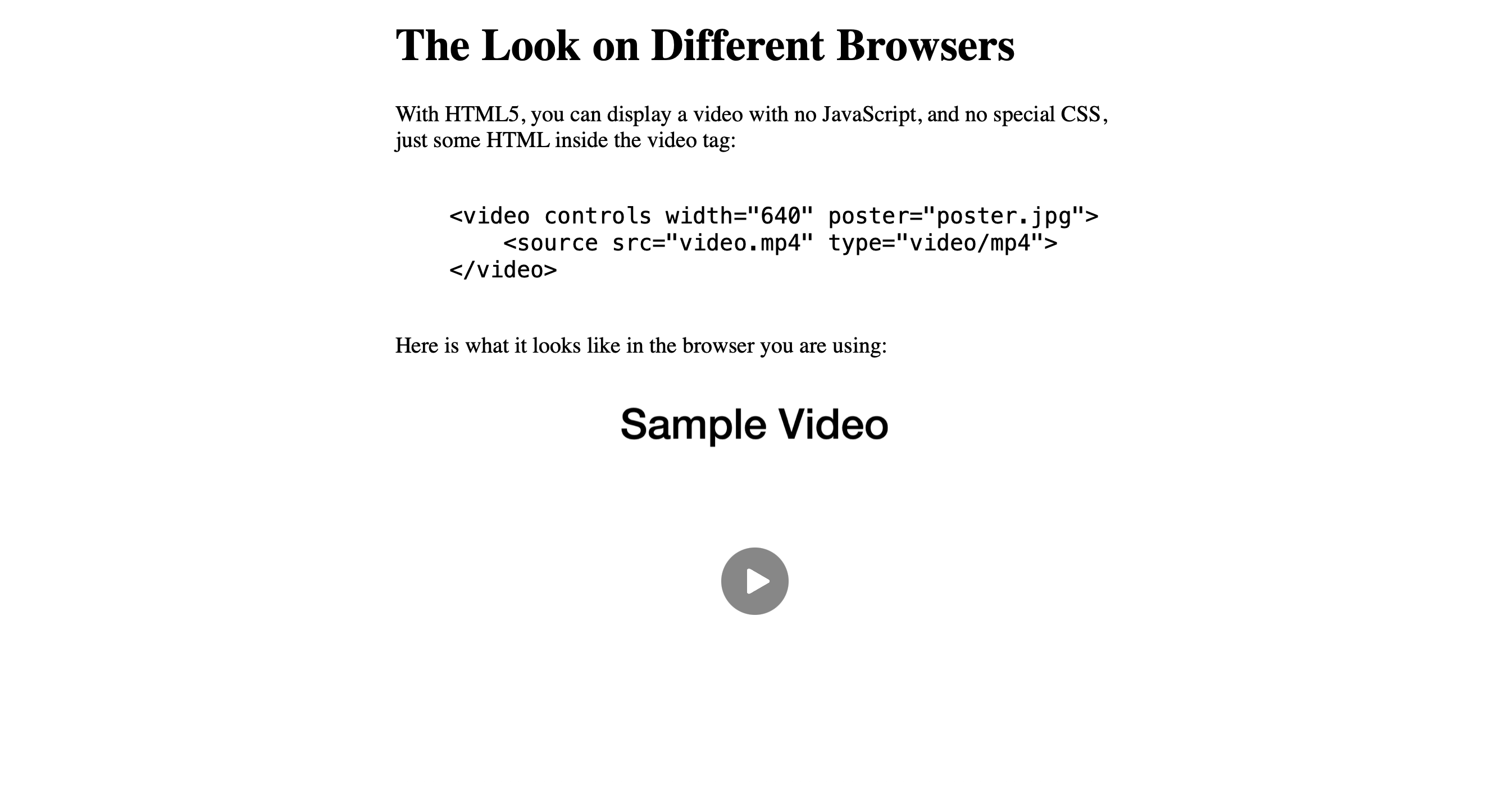
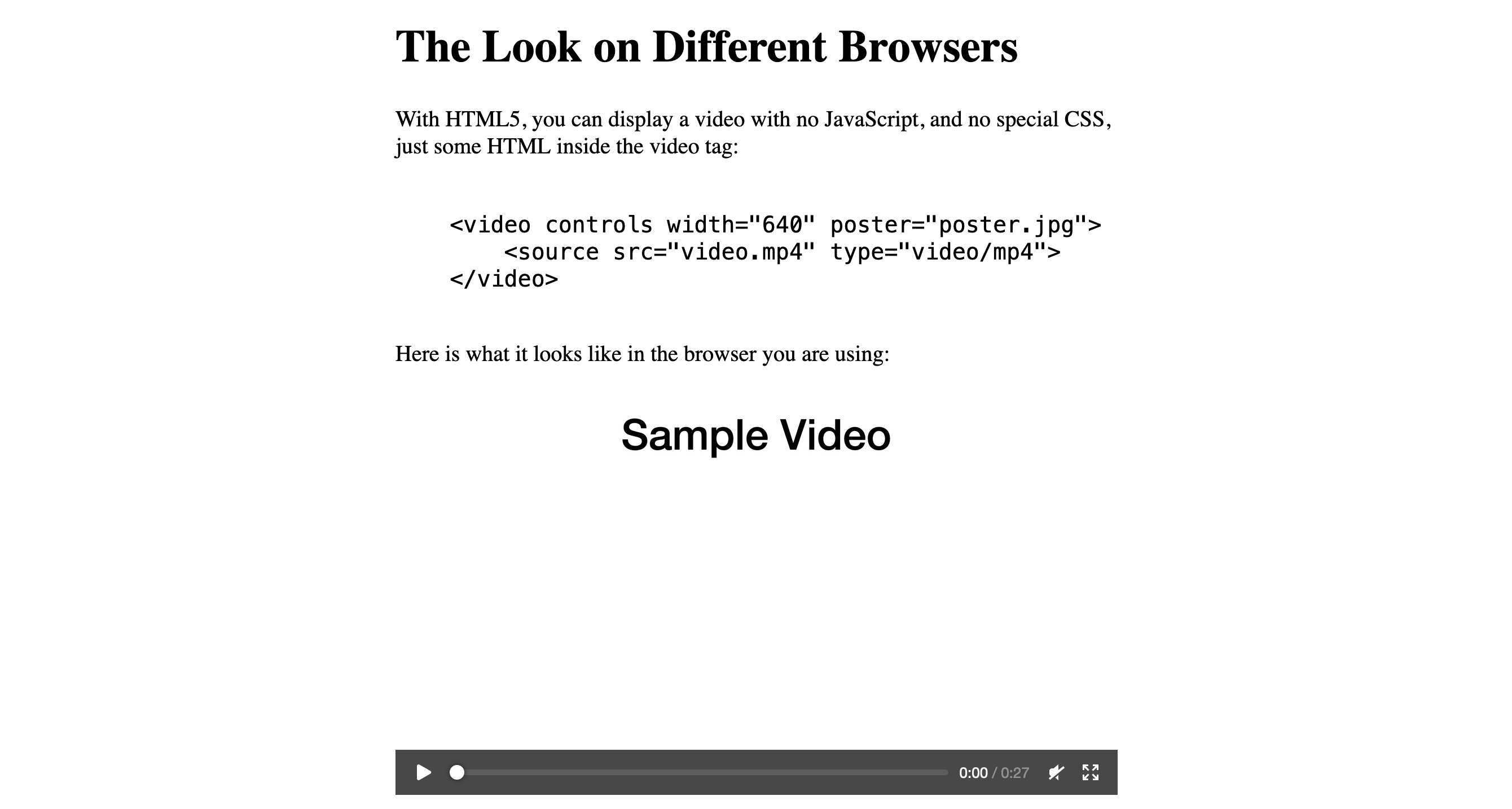
Return to paulromer.netWith no special CSS, and no Javascript, Safari and Firefox display a perfectly reasonable video player on any web page that uses the HTML5 video tag.
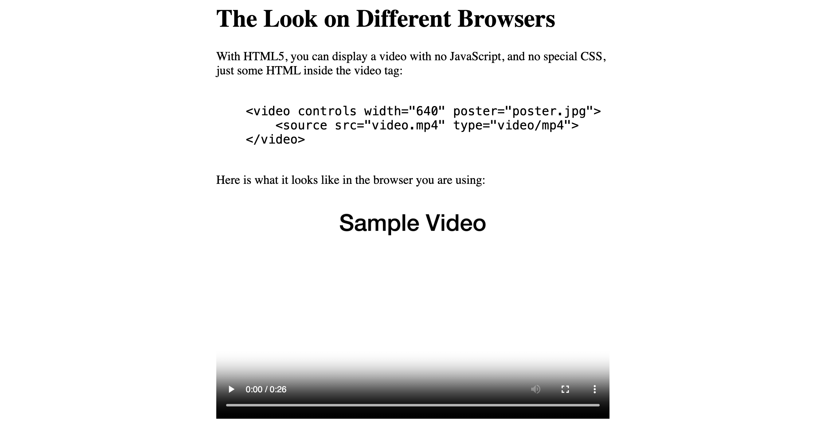
In contrast, Chrome and Chromium-based browsers such as Edge, Brave, and Opera display a strikingly ugly video player that makes the page look amateurish.
The HTML5 video tag makes it easy for anyone to include a video on a web page--as easy as displaying a static image. To protect its YouTube monopoly, Google needed some way to discourage people from going down this simple path. Because it controls the look of the HTML video tag on the majority of browsers, Google can make that HTML video solution that is easy for the author of a page look amateurish and ugly for most viewers of the page.
Anyone who tries to improve on the default look will end up in a confusing and ultimately futile time-sink. In practice, this means that most people avoid the HTML video tag. They upload their videos to YouTube and pasting into the page the more attractive YouTube video player.
With HTML5, you can display a video with no JavaScript, and no special CSS, just some HTML inside the video tag:
    <video controls width="640" poster="poster.jpg">
        <source src="video.mp4" type="video/mp4">
    </video>
Here is what it looks like in the browser you are using:
Odds are that you are viewing this page using Chrome or one of its Chromium progeny. If so, what you see is mess. I could encourage you to view it using another browser, but you and I know that you won't. So I'll show you what this page looks like on other browsers.

As you would expect, the Safari solution from Apple is the most elegant. It minimizes Tufte's metric of badness, "non-data ink."

Firefox is next best; there are a lot of pixels that won't do anything useful until the user clicks play, but at least there is some logic to how they line up.
For those of you with the good sense to use Safari or Firefox, take a look at the hot mess that confronts all those people using Chrome/Chromium:

Chrome makes it look like some teenager tagged the page with spray-paint.
Maybe it's just me, but the gradient seems to sag in the middle and perk back up on the ends. It's bad enough on the page, but even worse in full-screen mode because the spray paint lingers longer on top of the video.
For future reference, this static image is the look under Chrome or Chromium version 120.0.6099.129, which was current as of Jan 1, 2024.
To keep things simple, all the video players that I show on these pages stick to the simplest possible case. There is a single '.mp4' video and a '.jpg' image as poster. The video and the poster are the same directory as the page that references them.
Because I've used no JavaScript and the absolute minimum of CSS, it is very easy to see the effect that the browser has on the look of the video player; and in comparisons of different pages, to see the effect that a change in the CSS has.
It is easy to find claims about how various bits of CSS can target Chrome/Chromium and make its player look better. So far, all the claims I've found have turned out to be false.
The pages linked below highlight two such claims. If you view them with Chrome/Chromium you can see the effect of the proposed CSS. (The changes are specific to Chrome/Chromium; they have no effect on the look of the page when viewed using Safari or Firefox.)
If you find other interesting "purported" solutions to this problem that look like misinformation, test them on a local development server first. The one that is included as part of Python is perfectly adequate for this purpose. To save yourself the trouble of creating a small '.mp4' video and a poster to use for testing, here are links to download the ones that I've been using here:
If you have something interesting, send a link and some indication about what your tests show to me via my contact page:
Contact FormI doubt that there is a viable pure-CSS solution that makes the HTML player look reasonable on Chrome/Chromium.
The HTML video control almost surely looks as bad as it does on Chrome/Chromium because Google wants it to look so bad. For anyone looking to post a video, Google wants the easiest path to be:
If, nevertheless, you want to search for a pure-CSS, no-JavaScript version of the player that improves on the current look of the Chrome/Chromium default, no one is going to stop you. Just be sure you understand that it is a solved problem to write a better video player using JavaScript. In fact, Google has one that they'd love to have you use for playing YouTube videos. Don't waste your time reinventing that wheel.
If you do come up with some homemade CSS that looks promising, test it on your local development web server. When you are testing, be sure to try both videos that are dark and videos that are light. If you are convinced that what you've found is an important improvement relative to the status quo on Chrome/Chromium, once again, you can send me your CSS and the HTML between your video tags via the contact form on my website:
Contact FormI'll create a page that shows your solution to the world.
If there is a simple path that let's people post videos without getting into bed with YouTube, there will probably be takers.
Here is the minimal CSS that this page uses:
    body {
        margin: 0 auto;
        max-width: 640px;
        font-size: 20px;
    }